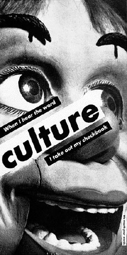
FEMALE STUDY: BARBARA KRUGER'S RED & BLACK
Barbara Kruger, 1987
The first time I saw the above image I was 11 years old. The postcard was pegged to a bulletin board collage at my friend Blake's house. The same friend who influenced me to think that anything "trendy" was super lame. Blake also owned a Prada purse. My mind was blown.
I didn't understand Descartes, "I think, therefore I am" at that age, but I understood the Barbara Kruger version enough to know that the artist was taking a stab at consumerism. No one told me the artist was Barbara Kruger, that was something I learned a few years later, but already, I felt like whoever this was, they were speaking on behalf of people like me.
Barbara Kruger is more contemporary of an artist than those I usually post about, but I've noticed ad campaigns all over recently that straight rip her style without honoring the jabby undertones of what the red background with white text, or white background with black text has come to mean, so I thought I'd revisit her work a little bit to set the record straight.
1985
Barbara Kruger has most recently lived and worked in Los Angeles. Given that I lived 12 years in Los Angeles, and spent 30 years in California in general, Barbara Kruger's work is a personal subject. In my youth, I was a staunchy feminist, and a critic of consumerism who hung in the 'art scene.' Barbara Kruger wasn't as much of a god as she was like the LA sunshine to me, just something that shows up everyday. Plus I grew up in a Stepford Wives-type suburb, where money and female oppression were the norm. I saw Barbara Kruger as my voice. I even started putting my own statements on the artwork I made as a teenager, she had influenced me that much.
I mean, just read how funny the caption below is vvv
Barbara Kruger, 1991
Barbara Kruger is among the first to use appropriation art through pictures and text, something that has since become a widespread practice in fashion, art, and funny enough, now even in advertising. By using words and found images, Kruger subverts the common ad with social critique through postmodern conceptual art.
For me personally, Kruger's humor and dark undertones used to discuss reproductive rights and built in female oppression (something I still think even the most evolved males: gay/straight/trans or otherwise, have yet to fully comprehend) has always stood out to me. The work is politically charged, totally in the vein of Bauhaus graphic design, and easy to understand, even for the simpleminded folks who oppose her messages.
Barbara Kruger was born in Newark, New Jersey in 1945. She attended Syracuse University in 1964 for one year before moving to New York, where she studied at Parsons School of Design. At Parsons, Kruger met artists Diane Arbus and Marvin Israel, who are said to have introduced Kruger to photography, fashion, and magazine sub-cultures. After a year at Parsons, Kruger dropped out and started working with various Condé Nast magazines as a graphic designer, where she was quickly promoted to art director and picture editor for several magazines. This career went on for a decade before Kruger moved to Berkeley, California, where she taught at UC Berkeley for four years.
By 1979, Kruger started using found images from mid-century American magazines in her art, pasting messages in Bauhaus fonts with color blocked backgrounds over the found pictures. Applying her graphic design sense, Kruger's work mimiced advertisements, but subverted the familiar with topics of gender, consumerism and equality.
What's really cool is once Kruger saw that her work was well received, she started printing her images on gift items, so the 80s and 90s were flooded with Kruger tote bags, postcards, mugs, t shirts, posters, whathaveyou; which is a hilarious way to blur the boundaries between art and consumerism, while also expanding her reach in a similar fashion as branding does. (Hello? Genius).
Using the power of her ubiquity, Kruger became well known for her work, and was often commissioned to make political statements on behalf of groups such as reproductive rights advocates. Like me in my youth, Kruger was seen as a voice for people who had something to say.
In 1989 Kruger made the image below, (left), for the Women's March on Washington, which was a march in support of legal abortion. A year later in 1990, Kruger used this slogan in a billboard commissioned by the Wexner Center for the Arts. Twelve hours after the billboard went up, a pro-life group responded to Kruger's work by replacing the adjacent billboard with an image depicting an eight-week-old fetus. (Um, super metal, guys)...
1989
1990
Evolving with contemporary art, from the 90s through today, Kruger began creating site-specific work that is pasted on sides of buildings, buses, trains, and museum walls.
Commissioned by MOCA of Los Angeles, the image top right, is the among the first of her site-specific work. The concept originally included messages pasted over the the American Pledge of Allegiance, but after some test drives with the idea and community backlash, the work was toned down, and the flag salute was eliminated. This image was first exhibited in a group show, and then a year later pasted to the side of a warehouse in Little Tokyo, Los Angeles where it showed for two years.
I love Barbara Kruger so much I could catalog her entire work here, but in the end, it's all much of the same thing. Even if it's really good. Today, given that she is fairly well known, she continues to work on site-specific pieces through commissions all over the world. She also keeps making her paste ups, as we have seen that over the last 30 years, change is slow enough to come that her messages are as poignant today as they were at their beginnings. With the seeming timelessness of her style, Kruger is able to revisit mediums and platforms such as magazine covers and simple paste ups regarding abortion, political statements, female oppression, popular culture and consumerism.
I felt like since her work is so familiar at this point, that it was almost "too soon" to talk about her here, but I couldn't help it after seeing so many ads abusing her style. Guys, if you're going to rip her off, at least make the words say something punk.
K? Thanks.
Courtney Bagtazo, © 2016


