DESIGN STUDY: CONCEPTUAL ARCHITECTURE, 'SUPERSTUDIO' & UTOPIA
Superstudio - "Happy Island," 1971
I've been studying architects quite a bit lately. I'm especially interested in their relationship with Utopia. It's as if each rendering is an insight into the architect's notion of perfection. People are depicted using a design... sitting on a bench having a sandwich, walking up stairs, etc. These drawings portray ideals of society as much as they portray the utility and applications design.
While I mostly design things of absolutely no utility, like an architect, I am nevertheless considering the function of everything I make as well. If one did not have to wear the things I make, my rings would be outrageous, I'm sure. And I would have produced a few of the necklaces I designed early on that require directions in order to be worn correctly.
But what if I didn't have to consider reality or application in my designs?
In the mid 1960s through the 1970s architects began exploring the notion of conceptual architecture by asking a similar question. By the 1960s almost everything in architecture was 'modernist' cement and steel blocks, and as a reaction to this homogeneity, some architects began rejecting the wholesale acceptance of futurity and modernism in general.
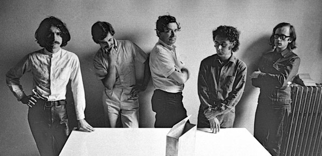
Perhaps the first to do so, (and my favorite) is a group from Florence, Italy who called themselves Superstudio.
Superstudio formed in 1966 and began their work by creating fairly useless things made of wood, glass, steel, brick or plastic. But this work quickly was followed by a few useful objects such as tables and chairs. Despite their utility however, these objects were not intended for use as much as they were intended to be used as a means to critique consumerism and society's, "continuous drive for novelty." Blandly designed, these objects served as a rather politically charged message from Superstudio that western decadence must be put to an end.
In 1968, architecture & design magazine Domus published some of Superstudio's work (above) where people were depicted 'using' architecture in unorthodox, and perhaps even impossible ways. Considering conceptual architecture had not been formally introduced to society at the time of publication, Superstudio was asked to publish a theoretical article in Domus as a follow up that same year. The combination of the two publications is one of the finest examples of early postmodernist thought, in my opinion, and perhaps the first example of conceptual architecture.
In Superstudio's follow up article, a sort of manifesto was created where their theories were explained. Citing prior movements in architecture in three main stages known as: architecture of the monument, architecture of the image, and technomorphic architecture, Superstudio's manifesto titled, "Superstudio: Projects and Thoughts," simultaneously rejected futurism and historical revival, arguing for an all-together new approach to architecture they called, architecture of reason.
Just read this amazingly postmodern excerpt:
The increase in the speed of reading (transport as a factor in spatial velocity, consumerism as a factor in temporal velocity), and the increase in social mobility, call for architecture that can take stock of the situation moment by moment... To bear witness becomes working in history, with history and for history.
Today we are all "intellectuals" or cultivated. Everything seems charged with reference and recall. The primitives of modern architecture – the Bauhaus, the 1920s – are the first models for the operation, initiators of the key cultural position that we are interested in continuing. Not "revival" but "survival" – permanence, that is, of vital reason.
We begin anew from the art of building, from the economy of materials, from the reasons for construction and from the meanings of a building. Reason has reaffirmed its place, accounting for itself.
I'm such a nerd, I get super excited reading that. Perhaps because what they are saying is still valid today. Everyone is not only cultured now, but they're also photographers, filmmakers, critics and everything else outside of science and medicine that was once preserved for specialists. And consumerism is likely worse now than it was in the 1970s. With webstores at anyone's fingertips, people can both create and patron a sales platform without much capital. Plus we've all accepted personal advertising through social media, and originality in idea or design is pretty hard to come by. So yes, Superstudio, yes! Let's PLEASE design from reason rather than novelty. (I'm looking at you 14k emoji face earring studs)...
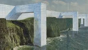
But I digress... Having established a cannon of ideas, Superstudio began exploring what they called, "negative utopias," eventually publishing a series of works in 1969 known as Il Monumento Continuo (or Continuous Monument).
This series, (above) was a direct attack on the dull nature of modern architecture in the 1960s. As steel and concrete boxes began to overrun cities, erasing historic culture, Superstudio saw a need to make fun of the possible outcomes of an unchecked modernist society. And while these warnings were clearly humorous, they were equally effective in making their point.
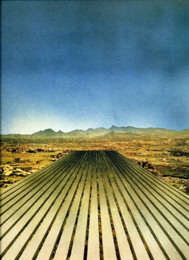
Continuing in this vein, Superstudio moved on to form an "anti-design" campaign in 1970, beginning with their series, Quaderna (above). Designed using severe, geometric forms made of plastic laminate normally found in provincial Italian towns, Quaderna was a comment on the excesses of pop design of the time. Applying similar aesthetics as Continuous Monument, both works served as a critique of global modern design, suggesting that the outcome of sparse, functional spaces results in sterile environments, "free of local color and individual expression." In both works, Superstudio is essentially suggesting that, "everything could be replaced by the continuous, global grid."
But of course this is simply satire, because though much of their work appears utopic and rather surreal; and while most of the objects present in their collages are actually modern and beautiful, there is a bleak undertone of sterility that suggests modern, man-made objects have the ability to take over nature and humanity in adverse ways.
Excerpts from "12 Ideal Cities," 1971
Disillusioned with modern society, global culture and consumerism, Superstudio continued their work in the 1970s mostly with collage. Partly due to the economic decline and scarcity of resources in post-war Italy, but more importantly as a result of their critique of society, Superstudio created a corpus of work without creating objects.
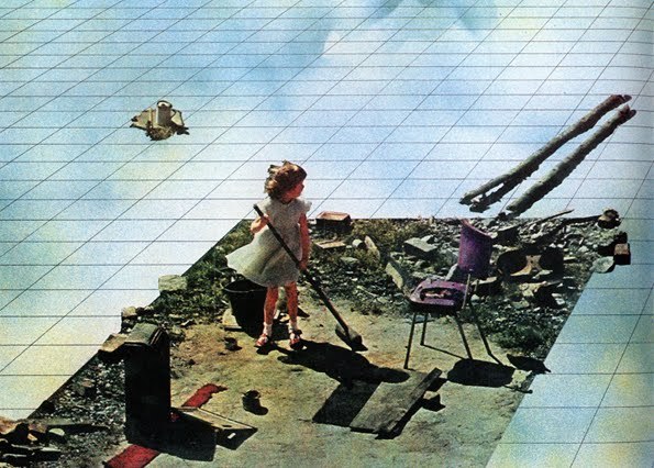
In 1972, a series of collages were made with a grid motif. In the collages there is a theme between nature and humanity, which are juxtaposed with man-made elements such as modern architecture and consumer goods. The grid motif, used again by Superstudio, this time is meant to represent not only man's need to organize and categorize, but it is also used as symbol of 'democracy,' as all points of the grid are considered equal. In this series, the grid is known as the 'superstructure,' furthering the discussion started with Continuous Monument.
Much of these collages were put into a film, Supersurface - An alternative model for life on the Earth, in 1972. In the film, Superstudio's theories are reiterated, but the film furthers their discussion by proposing life "without three dimensional structures as a basis." Again, this is satirical, but the message serves as a warning against hyper-modernity and homogeneity.
This film was the first of five films in a series, Fundamental Acts. In Fundamental Acts, each piece was dedicated to what they called "primary acts in human life," namely: Life, Education, Ceremony, Love, and Death. Supersurface was made to correspond with the first act: life.
The five stories in Fundamental Acts were used as, "philosophical and anthropological reconstruction of architecture" and first appeared as text, images and storyboard in Casabella magazine between 1972 and 1973. The purpose of creating these films for Superstudio was to "explore a propaganda of ideas, beyond the typical channels of the discipline of architecture."
Currently, only two pieces of the five films are available to the public, both of which I find poignant and hilarious. (The second is my favorite of the two).
Click on thumbnail below to open a new tab for 'Supersurface.' PLEASE watch it in its entirety... Also the article below the video is worth reading. (After you're done reading this, of course).
Click on thumbnail below to open a new tab for 'Cerimonia.' Trust me, it's really good.
After their films, it is unclear what exactly Superstudio was up to, because there's not much else about their work post-1973. I do know that the group dismembered in 1978, though each member continued their work as architects (or architecture theorists, at least) afterwards.
Since Superstudio's work was politically charged, and like most maturing adults, the radical politics of our youth tend to appear extreme, unnecessary and maybe even completely incorrect later in life, it is understandable that the group could not continue working together under such circumstances forever. (Abandoning their political views is cited as a major reason for their dismembering, btw). Regardless, Superstudio's contribution to conceptual architecture and conceptual art in general was massive. I likewise think that their critique on society was needed then, and could stand to be heard again today.
Courtney Cady Bagtazo, © Bagtazo 2016


